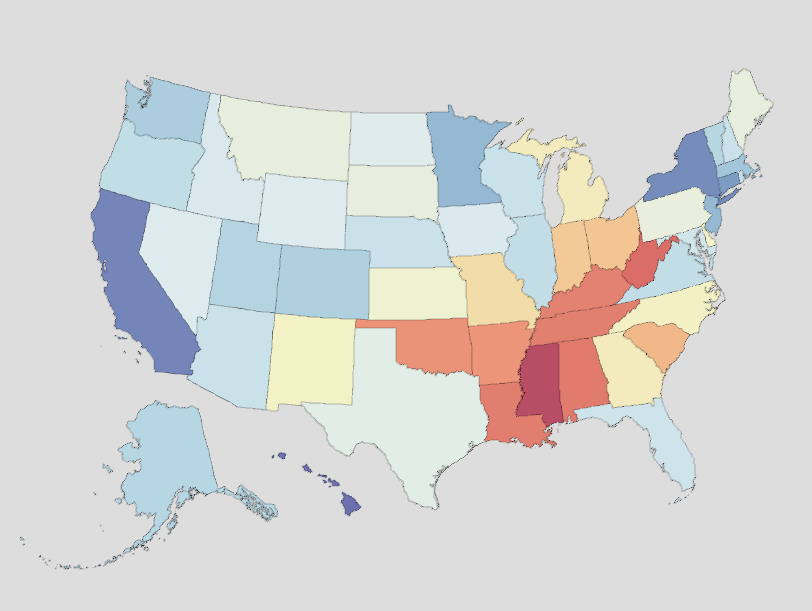
The Institute for Health Metrics and Evaluation (IHME), a research organization based at the University of Washington’s School of Medicine, provides a US Health Map consisting of important health indicators, including life expectancy, mortality rates, and risk factors, for both states and counties across the United States. The interactive data visualization can be manipulated for state, county, year, age, sex, and racial and ethnic group, allowing one to narrow down the provided data.
The life expectancy indicator provides a color range to demonstrate the differences in life expectancy across the country. As of 2019, the latest year featured, national life expectancy was 79.05 years. The state with the lowest life expectancy was Mississippi at 74.67, while the state with the highest life expectancy was Hawaii at 81.93 years. Washington’s state’s life expectancy is listed at 80.1 years, about one year above United States life expectancy.
In 2014, the national mortality rate was 545.51 deaths per 100,000 population. In comparison, Washington state’s mortality rate was 420.24 deaths per 100,000 population. The highest mortality rate by cause for Washington state was 668.25 deaths per 100,000 by “Non-communicable Diseases”, including all forms of cancer and leukemia. The highest cause within this category was “Tracheal, bronchus, and lung cancers” at 49.61 deaths per 100,000.
Prevalence measures the proportion of a population that has a particular characteristic in a given period of time. Thus, risk factor prevalence proportion is the proportion of the population that falls within a given risk factor. The highest prevalence proportion among the main risk factors listed in the US Health Map was 61.84% for “Alcohol Use, Any Drinking” for Washington state in 2012. The same year, the lowest prevalence proportion, 12.71%, was for “Diabetes, Total”.

