
United States County Migration Patterns
Tracking net migration from county to county
by Trends Staff
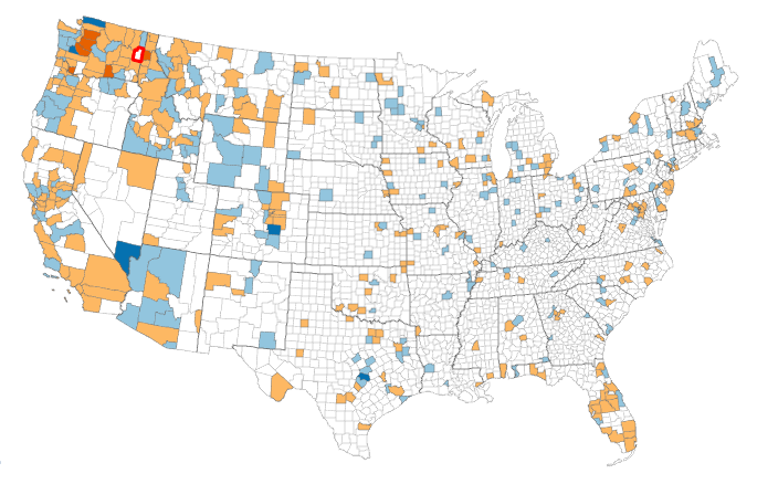
The University of Wisconsin-Madison has published an interactive map detailing United States migration patterns by county using net migration statistics from the US Census. The map offers 10-year period datasets with the most recent data featuring the 2000s (2000-2010). Selecting a county offers detailed data on the county’s net migration, including the rate per 100 and total number of net migrants for the decade.
Net migration in this dataset is defined as the inbound migration from the selected county subtracted from the outbound migration to the second county. Thus, a negative net migration means the county is losing population, while a positive net migration means the county is gaining population. All time periods allow one to choose different age ranges and net migration by race.
To understand this, let us select Chelan County’s net migration for the 2000s. The map shows that Chelan County had a net mgiration rate per 100 of 3, and a total number of net migrants of 2,259. Douglas County had a net migration rate per 100 of 0, with 204 net migrants. The Washington county with the most net migrants per 100 was Franklin County at 30, and the county with the least was Yakima County with -1. Yakima County had a -2,815 number of net migrants.
This data visualization allows for substantial exploration of county-to-county migration patterns. As stated, this exploration can include specific characteristics for the investigation of migration trends by race and age. These factors can tell us quite a bit about a county’s status and its political and economic climates. Probing this data may reveal many surprises if one is willing to dig deep enough.